
Whenever we see data from a SWOT pass over our usual maps of sea surface height (SSH), we feel like we are adjusting our lenses to have a clearer view of the ocean. Our traditional SSH maps, built by gridding along-track altimeter data over a 10-day period and tide-gauge data near the coast, have allowed us to see large mesoscale features (i.e., length scales larger than 100 km) like the eddies from the East Australian Current and the Leeuwin Current. Since 2023, SWOT has given us more information about the shape and intensity of these features, shown us what’s between those eddies – smaller scale fronts and sub-mesoscale eddies – and measured the SSH near the coast.
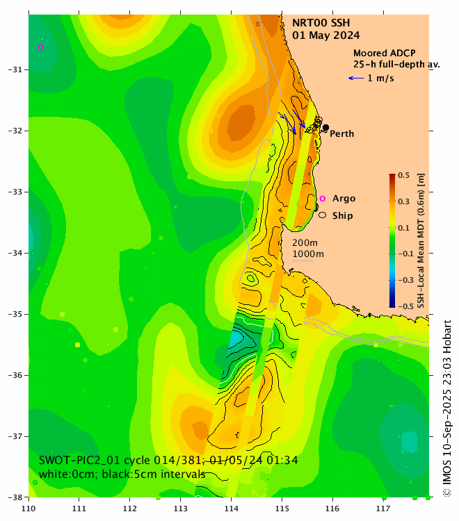
We have added a new regional SSH ‘SWOT experimental’ product (Fig. 1) to the website to help us explore the SWOT dataset further. These regional SSH maps combine wide-swath altimetry measurements from SWOT with the existing IMOS-OceanCurrent Gridded Sea Level Anomaly (GSLA) dataset and with in-situ measurements, like surface currents from ocean drifters, and full-depth current velocities from moored profilers (blue arrows, Fig. 1).
The SSH shown in the maps is calculated like this:
SSH = SLA + MDT − MDT
where SLA is the adjusted sea level anomaly (SLA) values (from both SWOT and IMOS-OceanCurrent GSLA), MDT is the CNES/CLS Mean Dynamic Topography and MDT is the ‘local mean MDT’.
The MDT represents the steady part of the SSH signal linked to ocean dynamics. It’s a mean calculated over the 1993-2012 period. The MDT signal is usually one order of magnitude larger than the SLA signal. For example, off Perth, the MDT near shore is 10 cm higher than offshore (Figure 2), in geostrophic balance with the southward flowing Leeuwin Current. Therefore, when adding MDT to SLA, the MDT signal dominates. To allow the visualization of the changing part of the SSH signal, we remove a fixed value from all data points in the region. This fixed value is the local mean MDT (MDT; i.e., the mean MDT value for the region shown on the map). This value is shown in parentheses in the title of the colourbar for each map. As a result, we have SSH values ranging from negative to positive, making it easier for us to see the features with variable SSH in the map (e.g., eddies, fronts, coastal SSH changes).
The MDT represents the steady part of the SSH signal linked to ocean dynamics. It’s a mean calculated over the 1993-2012 period. The MDT signal is usually one order of magnitude larger than the SLA signal. For example, off Perth, the MDT near shore is 10 cm higher than offshore (Figure 2), in geostrophic balance with the southward flowing Leeuwin Current. Therefore, when adding MDT to SLA, the MDT signal dominates. To allow the visualization of the changing part of the SSH signal, we remove a fixed value from all data points in the region. This fixed value is the local mean MDT (MDT; i.e., the mean MDT value for the region shown on the map). This value is shown in parentheses in the title of the colourbar for each map. As a result, we have SSH values ranging from negative to positive, making it easier for us to see the features with variable SSH in the map (e.g., eddies, fronts, coastal SSH changes).
Showing the SSH in the maps, instead of SLA, allows us to directly compare the sea level information with the movement of drifters in the maps, and to compare the values with the velocity of ocean currents measured by moored instruments and HF radars, all of which include the mean current, of course. The blue arrows off Perth in Fig. 1 show a strong SE flow measured by the moored ADCPs. The direction of the flow (averaged over the full depth and over a 25-h period to remove tidal effect) agrees with the SSH measurements from SWOT.
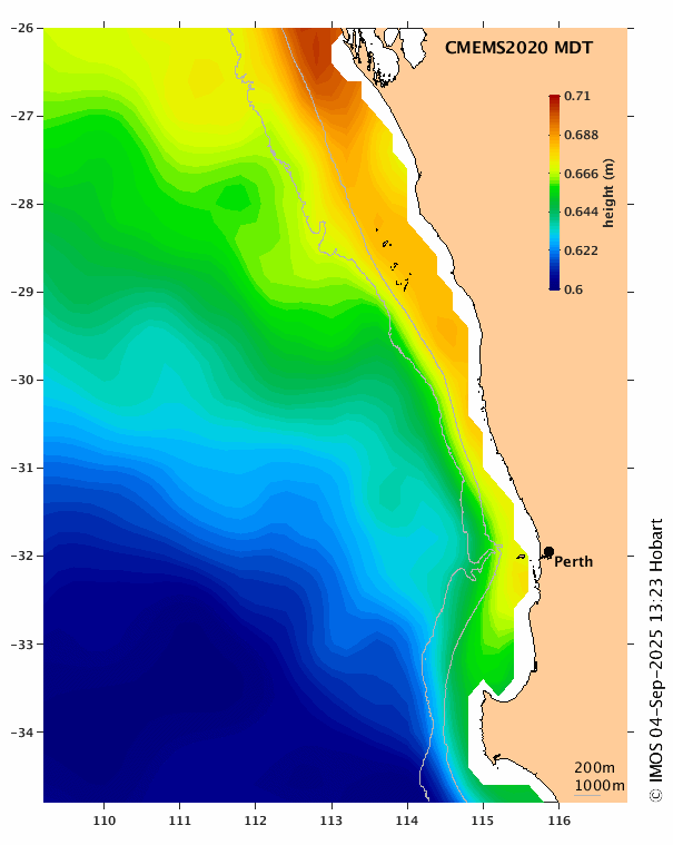
Figure 2: CNES/CLS Mean Dynamic Topography map.
The ‘SWOT experimental’ maps are accessed by the button shown in the orange box in Fig 3. You can choose between SSH (at least one daily map) and MDT (one map for 1993-2012) in the drop-down menu shown in the red box (Fig 3). The ‘info’ button (purple box) has more information about the data shown on the map.
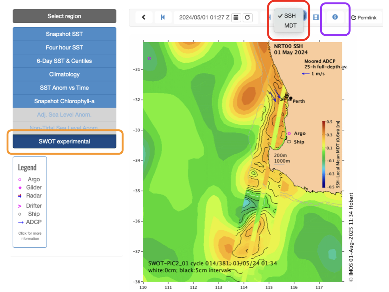
Figure 3: Main page of the ‘SWOT experimental’ SSH map for the southern WA region.
We have selected specific regions for this product. Combined, the regions cover the whole Australian coast, zoomed in enough for us to see the sub-10 km ocean features. The SWOT satellite revisits the same region every 21 days, with an exception from March to July 2023, when the satellite revisited a small number of regions daily. These ‘SWOT experimental’ maps are updated as soon as new SWOT near-real-time data is available, but – as this data is still experimental – the latest maps can be over a week behind.
Choosing one example to be highlighted in this news item was a challenge. We’re still exploring the SWOT dataset ourselves. So here’s a list of our favourite SSH maps where SWOT measurements are the main attraction:
- Across-shelf gradient of sea level off Brisbane previously described in a news item, now put into context against offshore gridded SSH
- Tiny cyclonic eddies south of Tasmania, with drifters
- Several small eddies grouped off Albany (WA)
- Drifter following a 50 km-diameter anticyclonic eddy off QLD (the eddy is not evident in the gridded SSH product)
- Small frontal eddy near EAC meander (154°E, 31°S)
- Improved SSH measurements off the Joseph Bonaparte Gulf. The gridded SSH product has a stationary cyclonic eddy off the Gulf, likely resultant from an interpolation artefact
- SSH in-shelf gradient, with low SSH off Coffin Bay. Another example of SWOT showing in-shelf features that were not resolved in the gridded SL
- Re-sampling of a small cyclonic eddy (157°E,34.5°S) over 12 hours, quantifying the decay in eddy amplitude and change in shape (before and after)
- Data to the west of Torres Strait, a region not included in the gridded SL product
- Beautiful eddy field off WA
Written by Gabriela S. Pilo